


When building applications, it's crucial for developers to understand the philosophy behind a product's user interface (UI) design. The UI is often the first impression customers have of a product or service, so careful consideration must be given to ensuring an intuitive and inclusive experience for all users.
While marketing is an important factor in the growth of a business, its design styles heavily reflect its care for its customers. From incorrect color contrasts to inconsistent fonts, every minor mistake incurs business losses.
Color theory is a fundamental factor in defining a brand identity. Popular services like Netflix and YouTube leverage shades like vibrant red to attract attention and convey a sense of urgency or excitement. Purple evokes luxury, leadership, and emotion.
The blue color is associated with loyalty, caring, safety, privacy, comfort, and responsibility. Therefore, we at Callchimp favor a theme of blue to convey trust and care to its customers. In our goal of creating a product accessible for all, Callchimp’s choice of the color blue is more than just brand psychology.
Approximately 8% of men and 0.5% of women experience color vision deficiency (over 350 million people globally), with the most common form being red-green colorblindness. As the figures below demonstrate, colorblind individuals perceive colors differently than those with normal vision.

The above figure is attributed to: https://www.healthdirect.gov.au/colour-blindness
According to colourblindawareness.org :
Numbers of tritanopes/tritanomalous people and achromats is very small, perhaps 1 in 30-50,000 people.
Tritanopes refer to people with blue-yellow color blindness (i.e. having difficulty in distinguishing blue-green and yellow-red).
As a company led by Google Developer Experts, Intel Software Innovators, and leading community organizers, we understand the need for inclusivity, accessibility, and building for all.
Callchimp's cornflower blue color theme along with its high-contrast and responsive design pushes forward the same ideas and shows its dedication and care for all its customers.
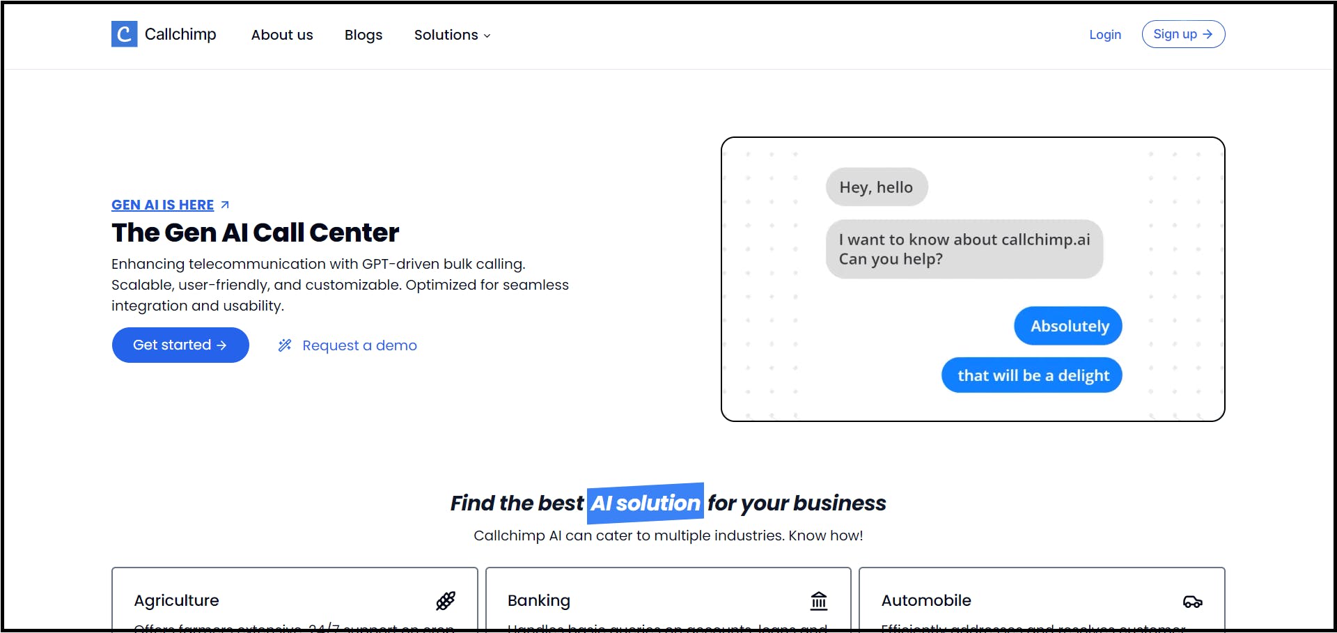
Above is a snapshot of Callchimp's landing page which the majority of non-visual impaired people experience.
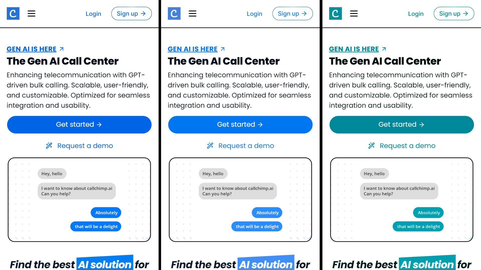
The above figure shows a responsive mobile view of the same page which the different color-blind people view. From left to right: Deuteranopia (no green), Protanopia (no red), and Tritanopia (no blue).
According to the World Health Organization (WHO):
Globally, at least 2.2 billion people have a near or distance vision impairment.
Callchimp is mainly a B2B product, which means its target customers are middle-aged adults. Callchimp's dashboard design has been specially curated keeping in mind its users. A high-contrast and connected design ensures data points are instantly visible without having to navigate unnecessarily.
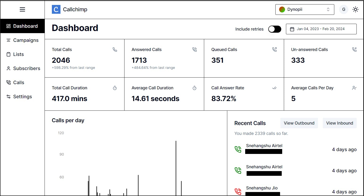
Above is a snapshot of the dashboard view of Callchimp. The high contrast ensures that even people with blurred vision can easily view the necessary data points.
High contrast for better readability: The white background with matte black text creates a high contrast ratio, which can make it easier for users to read the information on the screen, especially in low-light conditions. This can be especially helpful for users with visual impairments. Since most of the customers using the product will be middle-aged people who might have slight visual impairments, high contrast, and bold fonts enable them to view metrics and data with ease.
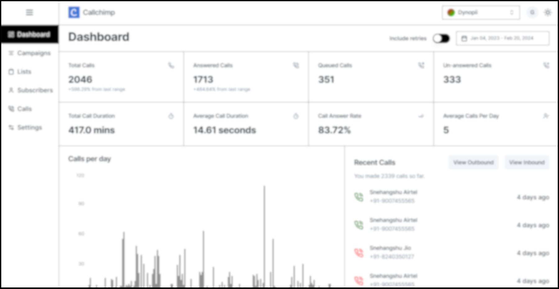
The figure above shows how a person with blurred vision will probably see the dashboard. The main metrics on top in larger fonts along with the high contrast, ensure that they're perceptible to the eye.
Connected design for easier navigation: The information on the screen is grouped into logical sections, which can make it easier for users to find what they are looking for. The use of white lines and boxes to connect related information can also help users see the relationships between different component blocks.
Minimalist design for less distraction: The dashboard is not cluttered with unnecessary information or decoration, which can help to reduce distractions and make it easier for users to focus on important information without having to navigate through a long learning curve.
Efficient use of space: The dashboard packs a lot of information into a small space, which can be helpful for users who are short on time or have limited screen space.
At Callchimp, customer care isn't limited to just AI capabilities or business goals. It's woven into every design decision to ensure every user, regardless of ability, can effortlessly interact with our solutions. Our mission is empowering communication—for all.